10 Benefits of Six Sigma for Civil Engineers
Is a civilization possible without civil engineers? Can defects and wastages be minimised by induction of Six Sigma in construction Industry! Let’s learn more on it …As per recently concluded survey construction industry has become the 2nd largest industry in India. During the last few years, enormous growth in infrastructure has been found .But how to Minimizing the waste to optimize the profitability is still a concern.
In Construction Industry anything which does not meet requirement is deemed to be called as a “Defect” and here Six Sigma Plays a pivotal role in meeting customer demand, reducing cost borne by the company, avoiding delays. Below are few staggering facts on construction industry:-
- 91% of the projects are delayed.
- 94 % of the projects overrun in cost by 15 to 20 %.
- And round by 99 % of the time expectations don’t meet reality.
All in All main goal of Six Sigma is to manage material, time, manpower and capital efficiently and effectively Six Sigma includes providing:
- Structured methods of improvement to reduce waste,
- Shorten production time,
- Promoting concurrent work, accelerating activities, improving planning and control and ultimately high levels of customer satisfaction.
By following below KPMG Six Sigma, construction industry can improve their profit & good quality of work for:-
- Better understanding of Project.
- Time line given to the project.
- What are the challenges in the project & plans to overcome the same.
- Safety of the work environment.
- Better knowledge of market rates.
- Better understanding of Competitors.
- What are the major wastes and delays?
- Where are the defects, reworks?
- Control & improve the quality of work.
- Compiles overall investment & benefits.
- Validate the results & saving after the completion of project.
There should be a lot of scope for Six Sigma in construction as you can statically analyse the way workers perform their site activities, knowing the numbers of skilled workers you have on your team to meet task.
MODULE 1: INTRODUCTION
Upon completing this module, you will be able to…
- Explain the concept and history of Six Sigma.
- Recognize the advantages of Six Sigma.
- Outline the roles in Six Sigma.
- Explain how the strategy works.
- List the industries where it is applied.
Six Sigma: Concept and History
- Six Sigma – a business strategy that
- Focuses on product and service excellence.

- Creates a culture that demands perfection.
- Motorola creates Six Sigma to combat Japanese dominance in business.
- Recognizes quality as the key to business success.

- Six Sigma becomes a benchmark of quality measurement.
- Motorola receives the Malcolm Baldrige Quality Award.
- Six Sigma is adopted by ABB, Texas Instruments and Allied Signal.
- Allied Signal CEO persuades Jack Welch of GE to try Six Sigma.
- 1998 in GE – Reported savings : $ 1 billion
- 2000 – Predicted savings : $ 6.6 billion

The advantages of Six Sigma are still being touted. It continues to be a way of life in more and more organizations.
- Target – The ultimate target of Six Sigma is a process or product that is virtually free of defects.
- Metric – Six Sigma metrics include all the required key performance indicators across the organization which are measurable and have targets for each of them.
- Philosophy – Its underlying philosophy is to improve customer satisfaction by reducing defects.
- Methodology – The DMAIC methodology is the road map to achieving the target.
- Toolbox – The toolbox is a combination of all these, and comprises the tools to achieve the goal.
Six Sigma: A Breakthrough Improvement
- Breakthrough in business improvement.
- Not incremental improvement.
- Produce major improvements in process performance in a period of 4 to 6 months.
- Make significant impact on bottom-line.
- Impact the way day-to-day business is conducted.
- A Six Sigma mindset permeates the organization, individuals become aware of
- Non-value added work.
- Ineffective processes.
- Poor performance.
- They take action to make the needed improvements
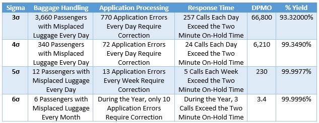
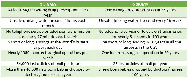
Three Sigma vs. Six Sigma
Six Sigma – Roles and Responsibilities
- Essential part of Six Sigma methodology.
- Encourages teams and team leaders to take responsibility for the processes.
- They have to be trained in the Six Sigma methods.
- Six Sigma has well-defined leadership roles.
- Each role has its level of expertise.
- Levels are characterized by the color of the belts.
Some key players involved:

- Own the process and lead overall effort.
- Exist at lower levels, depending upon the business size and core activities.
- Implement solutions.
- Have courage and ability to create environment to integrate Six Sigma philosophy.
- Have the vision and ability to lead change.
- Have ability to produce results.
- Responsible for strategic implementations within an organization.
- Train and mentor Black Belts.
- Help prioritize, select and charter high-impact projects.
- Maintain the integrity of Six Sigma measurements, improvements and tollgates.
- Develop, maintain and revise Six Sigma training materials.
- Qualified to teach other Six Sigma facilitators the methodologies, tools, and applications.
- Are a resource for utilizing statistical process control within processes.
- Heart and soul of the Six Sigma initiative.
- Lead Six Sigma quality projects and work full time till they are complete.
- Train and mentor Green Belts.
- Trained to spend portion of their time to complete projects.
- Have the ability to lead projects.
- Provide project specific knowledge.
- Help hold the gains.
- Have basic knowledge of Six Sigma.
- Do not lead any project on their own.
- May be responsible for small projects.
- Participate as a core team member.
How Six Sigma Works
- A data-driven methodology for eliminating defects in any process.
- Process must not produce more than 3.4 defects per million opportunities.
- Anything outside customer specifications.
- Total number of chances for a defect to occur.
- Fundamental focus of Six Sigma
- Process Improvement.
- Variation reduction.
DMAIC Simplified Methodology
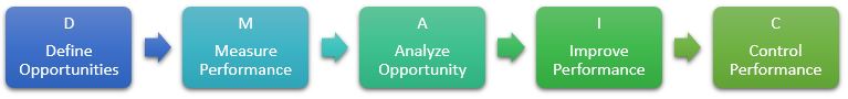
- D – Develop Team Charter
- M – Determine Baseline Performance
- A – Carry out Data Analysis / Carry out Root Cause Analysis
- I – Prioritize Vital Causes / Propose and Implement Solutions
- C – Monitor and Stabilize Process Improvement
where D and M are Characterization, A and I are Optimization.
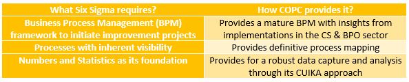
- COPC (Customer Operations Performance Center)
- Certification specifically designed for a BPO or call center organization.
- A set of key metrics/measurements and training for customer-centric service operations designed to: (a) Improve customer satisfaction through improved service and quality, (b) Increase revenue (for centers that are revenue driven), (c) Reduce cost of providing excellent service.
- To derive benefits from their synergy, COPC should precede implementation of Six Sigma.
- Processes: (a) Executed by Six Sigma Green Belts and Black Belts, (b) Overseen by Master Black Belts.
Six Sigma and its Application
- Administration
- Human resources
- Operations
- Retail
- Accounts
- Sales and Marketing
- And almost Everywhere!!
Summary
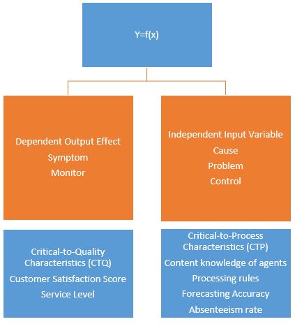
- In Y=f(x), X is Cause, Independent.
- CTP means Critical to Process.
- We can apply Six Sigma in every area irrespective of the type of industry.
- Six Sigma is a business strategy and is driven by the voice of the customer.
- If a process is moved from 5 Sigma to 3 Sigma, COPQ will Increase.
- In the Measure phase of the DMAIC process, we need to know How we are doing.
- CTQ stands for Critical to Quality.
- In Y=f(x), Y is Effect, Dependent, Symptom.
- 5.0 Sigma process will produce 233 defects per million opportunities.
- The function of a coach in Six Sigma organization is most likely to be filled by Master Black Belt and Black Belt.
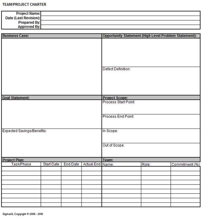
MODULE 2: DEFINE
Scenario
- Before starting the Six Sigma project
- Define the problem.
- Define the desired outcome.
- Helps set project deliverable in line with organization or program’s priorities.
- Helps every member of the team to have the same understanding of the project.
- Clears ambiguity.
- A business case.
- A problem and a goal statement.
- Project scope.
- A resource plan.
- Timeline for completion and review of each step.
- This phase lays the groundwork that allows the team to remain focused
Upon completing this module, you will be able to…
- Define the business case.
- Develop a problem statement.
- Develop a goal statement.
- Define the scope of the project.
- Build a resource plan.
- List out the key milestones.
Team Charter
- States what is expected from the team during each stage of the project.
- Lays down what is expected of the team at the end of the project.
- Keeps team focused on achieving project deliverable.
- Transfers project from champion to improvement team.
- Team charter is signed off and issued to project team by sponsor
- Sponsors projects to different members of team.
- Is responsible for outcome of these projects.
Business Case
- Presented to the top management.
- Focuses on defining the financial impact.
- Is crisp and to-the-point.
- States reasons necessary for the project to be taken up at that point of time.
- Address the consequences of foregoing the project (both on customer and organization).
- States how the project proposes to help achieve the organization’s objectives and targets.
Case Study
- Queries related to mobile phones from Samsung customers.
- Technical and customer service issues.
- Abandonment rate = number of calls dropped off before being answered but put in the queue/total calls received at VDN level.
- Project – To reduce Abandonment Rate (AR) for Samsung Mobiles.
- Reason for the project.
- The target for abandonment rate is 5%
- Abandonment rate is 24.02%
- Direct impact on end-user satisfaction
- More customer complaints.
- Lower CSAT scores.
- Estimated loss from the current AR trend $664,686 P.A
- Reduce AR to achieve more revenue and earn goodwill from client.
Problem Statement
- Describe ‘pain area’ of the project.
- Pain area – area where the problem exists.
- State the problem in a clear and concise manner.
- Address what is specifically wrong, or that what is not meeting the customer’s expectations.
- Clearly state “when” and “where” the problem occurs and “how big” the problem is.
- Example:
- Incorrect example: Average handling time for the past few months is very high.
- Correct example: AHT in an airline ticket booking office trended at 14, 15 and 12.2 minutes during October, November and December 2015, respectively.
- Correct example: Workers in sector four have assembled 82, 79 and 83 dolls per hour during January, February and March 2015, respectively, which does not meet the target of assembly of 100 dolls per hour.
- Impact of the problem should also be included.
- If AHT is high, what are the other metrics that are affected?
Goal Statement
- An Ideal goal statement should be SMART:
- Specific
- Measurable
- Attainable/Achievable
- Relevant
- Time-bound
- Set a goal as per customer requirements.
- As you progress, goal should become specific with measurable targets.
- Goal statement should not
- Presume causes.
- Prescribe solutions.
- Assign blame to other teams or departments.
- If root cause of problem is known, project need not be taken up – problem can be fixed.
- Example of a good goal statement.
- Reduce AHT to below 8 minutes by the end of April 2016.
Project Scope
- State the list of processes the team has to focus on.
- Define the boundaries of the processes to be improved, including exclusions.
- Include the start and stop points.
- Outline the resources available to the team.
- Be manageable.
- Constraints that may impact the team during the project.
- Time commitment expected from the team.
- ‘In scope’ and ‘out of scope’ activities in team charter.
Milestone
- Milestone – a detailed project plan with
- Key steps.
- Target completion dates of every phase.
- Well defined tollgate reviews.
- While setting target dates, be aggressive and realistic.
- Plan should detail how variations in actual duration of each activity will be dealt with to ensure all deadlines are met.
- Team charter will contain only tollgate review dates for each phase of DMAIC.
- Project plan.
- A live document to be shared between team members and project champion.
- Should be updated after each review or whenever required.
Resource Plan
- The resource plan has names of
- Team members
- Project lead
- Project coach
- Project champion
- A separate resource plan document is also prepared with the details of
- Champion’s level of involvement in project.
- Roles, responsibilities and authority of team members, team lead and coach.
- Method of communication between team and champion.
Team Charter Format
- A live document.
- Can be modified during any phase of DMAIC methodology, but only with the approval of champion.
Summary
- An organized and disciplined approach to problem solving in most Six Sigma organizations is called DMAIC.
- Six Sigma project methodology normally begins with Define.
- The process during the Define phase is Develop Team Charter.
- The problem statement covers Description of pain.
- A goal statement should follow Specific, Measurable, Achievable, Relevant and Time Bound approach.
- What is wrong and not meeting customer’s needs is an element of Problem statement.
- A goal statement must not prescribe a solution.
- A project charter will contain a business case, which can be defined as A short summary of the strategic reason for the project.
- The team for a typical Six Sigma project cannot be composed of any interested personnel.
- The team’s charter describes the team’s Mission, scope and objectives.
MODULE 3: MEASURE
Introduction
- Collecting accurate data on the current situation.
- Investigating problem to understand what is happening, when and where.
- This phase ensures that accurate and reliable data is collected to measure current performance related to customers’ CTQs.
Upon completing this module, you will be able to…
- Describe the tools used in determination of process performance.
- Outline the methods to collect data related to the process with a problem.
- Establish a baseline performance level for future comparisons of the process performance.
Process Mapping – Definition

- Visual representation of process.
- Shows who and what is involved in a process.
- Used as a communication tool.
- Allows people unfamiliar with the process to understand interaction of causes during the workflow.
- Contains additional information relating to Six Sigma project.
Process Mapping – Need and Benefits
- In the absence of a process map
- Activities will not be in line with actual process.
- Output will be different from planned.
- Confusion and chaos will reign.
- Increases process understanding.
- Underlines ownership and boundaries.
- Identifies process sequence, core process bottlenecks, and opportunities for improvement.
- Clarifies interactions between customer, supplier, management, and operations.
- Serves as a tool for training and discussion.
Process Map – Elements
- Basic elements of a process map
- Inputs
- Process steps
- Output
- Measurable parameters
- Resources
High-Level Process Map
- Includes 5-7 steps of processes.
- Used by a team to work on specific project.
Elements of SIPOC

- Suppliers – Providers of input for the process of being performed.
- Inputs – Materials, resources, or data that require the process to be executed.
- Process– A collection of activities that takes one or more inputs and transforms them into output valuable to the customer.
- Outputs – Products or services that result from the processes performed.
- Customers – Recipients of the output that results from the process performed can be both internal and external.
- Typically employed at the Measure phase.
- Used by teams to identify elements of a process before work begins.
- Helps define a complex project that may not be well scoped.
- SIPOC tool is particularly useful when it is not clear.
- Who supplies inputs to the process?
- What specifications are placed on the inputs?
- Who are the true customers of the process?
- What are the requirements of the customers?
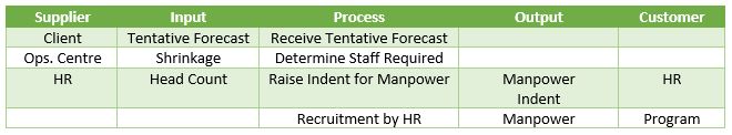
In this example, the department of Forecasting and Capacity Planning wants to create a SIPOC plan for manpower requirements. The start point of the process is the tentative forecast and the end point is the recruitment by the H R department. Let us understand how the SIPOC has been created: The first process in Forecasting and Planning involves receiving a tentative forecast. The input for this process is the forecast given by the client. So, the client here becomes the supplier. The next process is determining the staff requirements, for which the input is the shrinkage data and the supplier is the operations center. This continues till all the steps of the process are complete and the outputs are ready. In this example the outputs are the manpower indent and the manpower itself. They are handed over to the customers, who are the H R and Program.
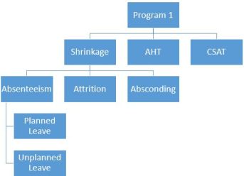
Process/Product Drill-down Tree
- Drilling into a question helps you
- Get a deeper understanding of it.
- Recognize and understand factors that contribute to it.
- Link in information not initially associated with a problem.
- Know exactly where further information is needed.
- Integrate customer CTQs to project CTQs.
- Steps to use the tool

- Write down the main problem.
- List points of next level of detail under main problem.
- Repeat process for each point.
- Keep drilling down until you understand factors contributing to the problem.
- If you cannot break down the problem, carry out necessary research to understand the point.
Example:
Data Collection Plan
- After identifying the problem, start collecting data.
- At the data collection stage understand the variation felt by the customer.
- Data collection plan helps.
- Understand the purpose for data collection.
- Know the type of data to be collected.
- Know the method of collecting the data.
- Understand the sample.
Example:
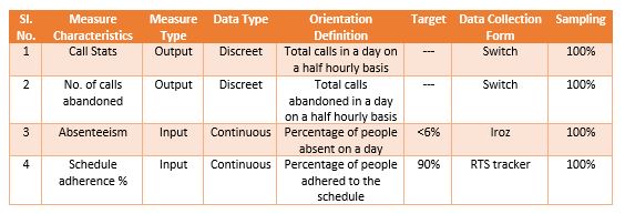
- Defines characteristics of input/output/process that the team will collect.
- Specifies the type of process element for which data is collected.
- Indicates type of data to be collected.
- Can be continuous data (example – 1, 1.1, 1.2) or discrete data (example – 1, 4, 15)
- Provides a definition of the measure characteristics.
- Specifies target which needs to be achieved for that characteristics.
- Specifies how and from where the data is collected.
- Specifies sample size for data collection.
Process Capability Analysis
- To measure baseline performance, the process capability measurement scale is used.
- To calculate process capability of discrete data.
- Calculate Defects per Million Opportunities (DPMO).
- Convert DPMO to Yield or Sigma level using Z table.
- Sigma is used as measurement scale because
- AHT is calculated in units of minutes and seconds.
- SLA is calculated as a percentage.
- CSAT has no unit, but is measured as a whole number.
- Only Sigma has a universal measurement scale for all types of characteristics.
- Units (U)
- Number of parts, assemblies, sub-assemblies, systems, processes, etc., that are inspected/tested.
- Number of characteristics that you inspect or test within the unit.
- Anything that results in customer’s dissatisfaction or a non-conformance.
Example:


Black Boxes indicates Defects in the above figure
- DPU = (Total number of defects / Total number of units) = (9/4) = 2.25 DPU
- TOP = (Total number of units * number of opportunities per unit) = 4 x 5 = 20 opportunities
- Defects per opportunity = (Total number of defects / Total number of opportunities) = (9/20) = 0.45
- Defects per million opportunities = (Defects per opportunity * 1 million) = 0.45 x 1000000 = 450000
- Sigma Value = ZST =1.6
Summary
- The process to be followed for the Measure phase is Define baseline performance.
- The tools used in the Measure phase are: Process mapping, Data collection, Process capability.
- A collection of activities that takes one or more Inputs and transforms them into Outputs that are of value to /customers is called a process.
- A process flow chart is A map of the system.
- SIPOC stands for Supplier Input Process Output Customer.
- Customer is the recipient of the process output.
- DPMO of a process having 20 defects with total opportunity of 50 is 400000.
- DPMO stands for Defects per million opportunity.
MODULE 4: BASIC STATISTICS
Knowledge of statistics is necessary as basic statistical tools are applied to manufacturing, sales and marketing, process, equipment design, and more to improve quality and initiate cost savings right away.
Upon completing this module, you will be able to…
- Define statistics.
- List the types of data.
- Recognize the use of normal curve in the data study.
- Explain descriptive statistics.
Definition – Statistics
- Statistics – mathematical science of collecting, describing, analyzing and interpreting a given set of data.
- Discrete data
- Continuous data
Data Types – Discrete and Continuous
- Data is discrete if there are only a finite number of values possible.
- Discrete data occurs when we are counting something using whole numbers.
- Makes up the rest of numerical data.
- Associated with some part of physical measurement.
- To find out – ask if it is possible for the data to take on values that are fractions or decimals, if answer is yes, then it usually is continuous data.
Data Types – Differences
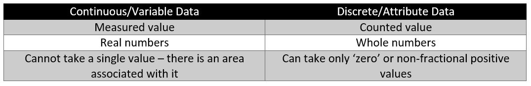
Normal Curve
- In statistics, data is usually represented as curves, diagrams, etc.
- Common representation – Normal curve.
- Normal curve – It is a tool used to tell how far the sample is likely to be off from overall distribution, in the form of a bell.
Example:
A survey has been made of people’s typical daily calorie consumption, and a graph that looks like this has been plotted. Notice that the numbers for people’s typical consumption has turned out to be normally distributed. That is, for most people, their consumption is close to the average. Fewer people eat a lot more or a lot less than the mean or average. Many people obviously are neither surviving on a single serving of rice and dal nor are eating six meals of chapattis and meat. Most people lie somewhere between. Therefore, for a normally distributed data on a graph, the curve would be in the form of a bell as mentioned earlier (see below figure). The X-axis (the horizontal one), shows the calorie consumed and Y-axis (the vertical one) denotes the number of data points for each value on the x-axis. In other words, the number of people who eat x calories.

Basic Characteristics of Normal or Bell Curve:

- The curve does not reach zero, or the x-axis.
- The curve is divided into two equal halves with equal portions falling on either side of the most frequently occurring value.
- The peak of the curve represents the centre of the process.
- Area under the curve represents 100% of the product the process is capable of producing.
Mean
The most commonly used method of describing central tendency. To calculate the mean, you add all the values and divide it by the number of values. (Calculation of Mean of scores = 45+34+37+42+40 = 198/5 = 39.6) So, while ‘mean signifies ‘average’, standard deviation shows the relation that a set of scores has to the mean of the sample. When the scores are tightly bunched together and the bell-shaped curve is steep, the standard deviation is small. When the scores are spread apart and the bell curve is relatively flat, that means you have a relatively large standard deviation.


Example 1:
Computing the value of standard deviation is complicated, but let us look at this example of a normal curve using the mean X bar.

One standard deviation away from the mean X bar in either direction on the horizontal axis side accounts for around 68.26% of the people in this group.
Two standard deviations away from the mean X bar account for roughly 35.46% of the people and three standard deviations account for about 99.73% of the people.
Example 2:
Let us take another example of a bell shaped curve for the Average Handling Time, or AHT, of calls.
The normal curve has a mean or average of 24 minutes. You can see the peak of the curve is the highest at that point. The standard deviation is 4 on either side of the horizontal axis. The area within one standard deviation, which is 20 to 28 minutes, accounts for 68.26%% of the given set of data. The area within two standard deviations accounts for roughly 95% of the data between 16 and 32 minutes of the average handling time. The area within three standard deviations accounts for about 99% of the data, which lies between 12 and 36 minutes at AHT.
Distribution and its Types
This figure shows a normal distribution, referred to as a bell shaped curve. There is a single point of central tendency and the data is symmetrically distributed about the centre (Mean) with no skewness. In normal or symmetric distribution, mean, median and mode are all the same.
- Distribution is an arrangement of values of a variable showing their observed or theoretical frequency of occurrence.
- Central tendency refers to the middle value and is measured using mean, median, and mode.
- Median is the score found at the exact middle of the set of values.
- Mode is the most frequently occurring value in the set of scores.
- Example: Median – 15 15 15 20 20 20 22 24 36 and Mode – 15 15 15 20 20 20 22 24 36. Therefore, Mean = 20.876, Median = 20 and Mode = 15.

Sometimes processes are naturally skewed. A distribution is skewed if one of its tails is longer than the other. Distribution when positively skewed are said to be ‘skewed to the right’. Similarly, distributions negatively skewed are said to be ‘skewed to the left’.

In a right skewed distribution, the data is less in the right tail than that expected in a normal distribution. Similarly, for a left skewed distribution, it means less data is in the left tail than expected in a normal distribution. For left or right skewed data, the median is between the mode and the mean.
Descriptive Statistics

- After data is collected, there is a need to analyze and interpret the data centre and its spread. This analysis is done using a tool known as descriptive statistics.
- Descriptive statistics is used to present data in a manageable form. For example, a simple number denoting batting average summarizes how well a batsman is performing in cricket. The single number describes a large number of discrete events. For a large number of continuous data consider the Grade Point Average (GPA) of a student. This single number describes the general performance of a student across a wide range of course experience.
- With descriptive statistics, you do run a risk of distorting the original data or losing some important detail. This is because a large set of observations are described with a single number. However, even given these limitations, descriptive statistics provides an effective summary that enables comparisons across people or other units.
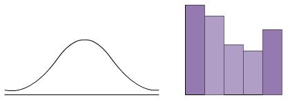
- Minitab is an application that gives the output of a given set of data both graphically and in the form of text, depending upon the type of tool being referred.
Example:
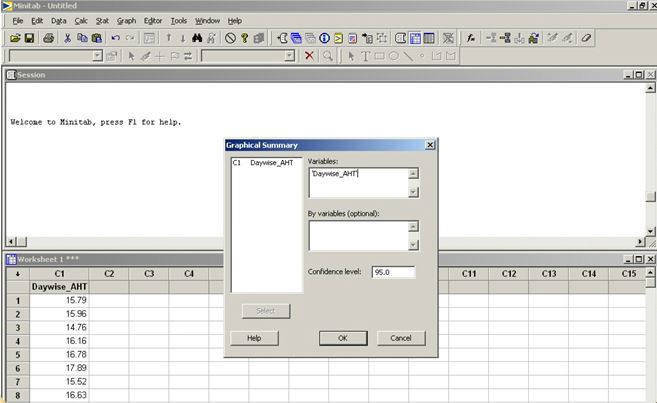
Let us consider the example of the day wise Average Handling Time or AHT in a call center to get a statistical summary of the data.

- Click Stat on the Menu Bar, then click Basic Statistics and Graphical Summary.
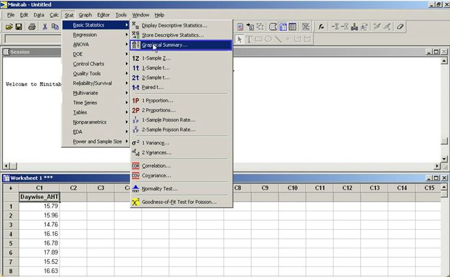
- The Graphical Summary window is displayed.
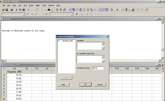
- Double click C1 and the variable ‘Daywise AHT’ is displayed in the Variables box. The Confidence level of 95.0 is displayed by default. Click OK.
- The graph of the Summary for the Day wise AHT is displayed.
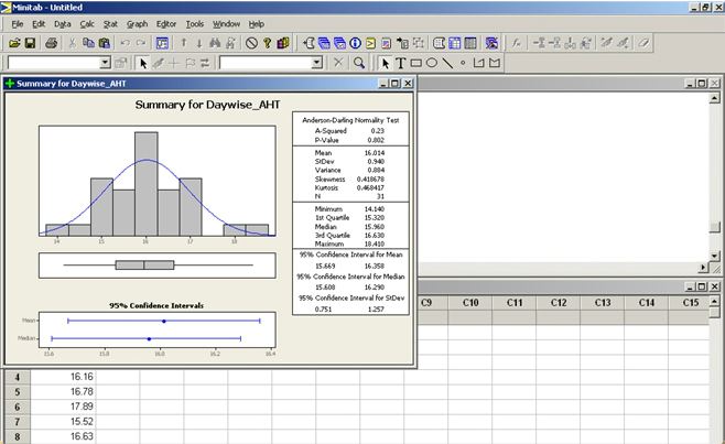
- By looking at the graph, we cannot confirm whether process is normal or not.
- Hence look at a number known as the ‘P-value’.
- If “P-Value is greater than or equal to 0.5” – process is normal.
- If “P-Value is less than 0.05” – process is not normal.
- Further analysis for a specific data can be undertaken only if process is normal.
- If the process is not normal, stratify data based on type and then check for normality of process before analysis.
Summary
- Offered calls is not continuous data.
- Queue time and Handle time are not a discrete data.
- One would normally describe recorded values which reflect length, volume and time as Measurable, Continuous and Variable.
- Talk time, Hold time and Wrap time are continuous data.
- Number of agents in a product line, Forecast calls ans Number of quality reps in a program.
- The percentage of data that can fall within plus or minus 2 standard deviations is 95.46%
- The percentage of data that can fall within plus or minus 1 standard deviation is 68.26%
- The percentage of data that can fall within plus or minus 3 standard deviation is 99.73%
- If a process has 14 minutes as mean and 1 minute as standard deviation, the interval where 95% of data can fall is 12 – 16 minutes.
MODULE 5: ANALYZE
- Basic objective of Analyze phase
- To establish an improvement goal that focuses on improvement of existing performance.
- Recommendations for the next phase.
- To ensure that the goal set is achieved in given timeframe.
Upon completing this module, you will be able to…
- Recognize the importance of the Analyze stage.
- List the various tools used for analysis.
- Drill down to the X for an identified issue.
- Explain each of the tools in depth.
An Introduction – Analyze Phase
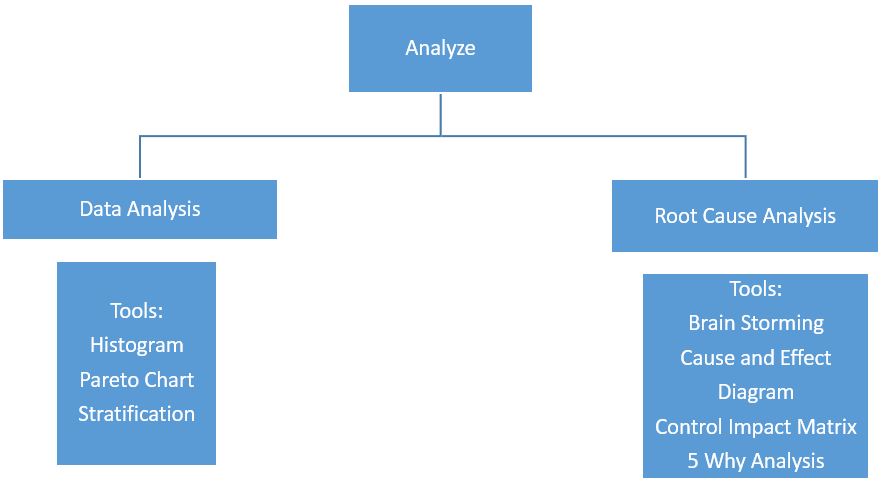
Tools for First Stage – Histogram
- A graphing tool that displays relative frequency/occurrence of continuous data values showing which values occur most, and least frequently.
- Categorized by three constituents
- Centre (Mean)
- Width (Spread)
- Overall shape
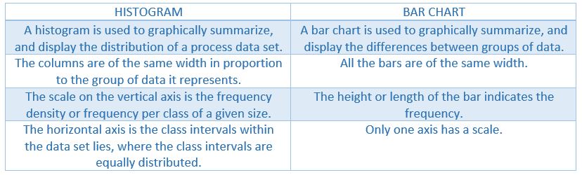
- Similar to bar chart but has differences
- To interpret data on the basis of its shape.
- To verify whether the process meets customer’s requirements.
- To analyze output of a supplier.
- To compare before and after outputs of a process after an improvement activity has been initiated.
- Histograms are based on different distributions resulting in various shapes. Each shape signifies something different, which helps you interpret the data better.
- There are about six types of distribution.


- Normal distribution – In this the data is distributed symmetrically on both the sides from the mean line, mean being the peak bar in the chart. The shape of the histogram is bell-shaped.
- Skewed distribution – This type of distribution occurs when the data is skewed either towards the right or towards the left of the chart.
- Double peaked or Bimodal distribution – The bimodal distribution looks like the back of a two-humped camel. It indicates that data, from more than one process have been combined together. Example: – Materials may have come from two separate vendors or samples may be from two or more separate machines.
- Comb distribution – The comb or edge peak distribution looks like the normal distribution except that it has a large peak at one tail. Usually this indicates a measuring problem due to improper gauge readings or a gauge that is not sensitive enough for readings.
- Plateau or Multimodal distribution – As there are many peaks close together, the top of the distribution resembles a plateau. These types of distributions occur when the data collected has a mixture of data from different sources.
- Truncated or (Heart-cut) distribution – The truncated distribution looks like a normal distribution with the tails cut off. Such a type of distribution occurs when the data collected has specification limits.
- Histograms can be created in Excel or by using the Minitab software.
Example: Let us first learn how to create a hologram in Excel using Histogram tool of analysis, an add-in module. Using a sample table of students and their test scores, let us explore how the Histogram tool works in Excel. The scores have been broken down at 50-point intervals (taking the highest and lowest scores as outer ranges). They are arranged in ascending order in column D.
- Let us start the Histogram tool by clicking Data Analysis on the Tools menu.

- Select Histogram.

- The Histogram dialog box will be displayed.
- Input range is the location of the input data in the Excel worksheet. The input range in our example is cells D2:D15.
- Bin range is the range against which we are going to draw a Histogram. The location of bins, that is, the bin range in our example is cells F2:F15.
- Note: If the Bin Range box is left blank, the Histogram tool automatically creates evenly distributed bin intervals. The number of intervals is equal to the square root of the number of input values. However, it is advisable to create your own Bin Range.
- Output location is the upper left cell of the range where the analysis is to appear. In our example, the output range is in cell G1. Output can also be placed in another worksheet or workbook.
- Display of the output – In our example, we select Chart Output. Output can be sorted or displayed in cumulative percentages.

- The Histogram tool analyzes all the input information, calculates the output, and displays it in column G and H.

- This analysis tells us that one score is less than 950, three scores are between 950 and 1000, 6 are between 1000 and 1050, and so on.

Creating Histogram using Minitab software:

- First, click Graph on the Menu bar. Then select Histogram.

- A window is displayed with all the types of histograms. Select Simple, and click OK.

- The Histogram Simple window is displayed.

- Double click C1, and the variable is displayed in the Graph Variables area. Click OK.

- A day-wise AHT Histogram is displayed.

Tools for First Stage – Pareto effect
- Named after Vilfredo Pareto, an Italian economist, who concluded that 20% of people controlled 80% of a society’s wealth.
- Pareto Charts display two main principles:
- Vital Few Trivial Many – identify vital few causes out of all the causes identified.
- 80% of the problems are due to 20% of the causes.
- Pareto charts – used to

- Analyze the data on the frequency of problems or causes in a process.
- Analyze broad causes by looking at their specific components.
- Focus on the more significant problems when there are too many of them.
- Communicate status to others.
- Breakdown big problems into smaller parts.
- Identify most significant factors.
- Identify areas to focus efforts.
Creating Pareto chart using Minitab software:
- When the Minitab tool is used for drawing a Pareto chart, there is no need to put the data points in ascending or descending order, unlike in Excel.
- Now let us create a Pareto chart for issue codes and defects identified along with the frequency.
- Click Stat on the Menu bar.

- Select Quality Tools, and then select Pareto Chart.

- The Pareto Chart window is displayed.

- Select Chart defects table. The “Labels in” and “Frequencies in” options are enabled.
- Double click C1 and C2 for the “Labels in” and “Frequencies in” boxes to be populated respectively.
- Now click OK.

- The Pareto Chart of Issue Code is displayed.

- Benefits of Pareto Chart
- Quantitative tool used to determine the segmented areas of focus.
- Graphically displays the most frequent occurrence of outcomes (little y’s).
- Helps get from Big Y to the little y.
Tools for First Stage – Stratification
- A technique used to analyze or divide a universe of data into homogenous groups or strata.
- Involves
- Looking at the data.
- Splitting it into distinct layers.
- Analyzing it to see the different patterns.
- Separation of data into categories.
- Needs to be done repeatedly.
- Stratify at one level.
- Within categories of that level, stratify again.
- By sorting data into multiple levels of groups with shared characteristics, you can pinpoint root cause of a problem.
- Stratification is used in combination with
- Histograms
- Pareto charts
- Bar charts
- Pie charts
- Cause and effect diagram – (a) To build a tree of branching characteristics, (b) Each one stratified further until root causes are reached.
- Characteristic used to separate data – stratification variable.
Example:
Here is some data from a call center. It relates to the QA scores of two teams – the ‘New Hires’ and ‘Tenure’. The ‘Tenure’ team comprises people who have been with the company for some time. Let us plot the data and study the stratification by creating a histogram.
- Open Minitab.

- Click Graph on the Menu bar.


- The Histograms window is displayed. From the options displayed in this window, select With Fit, and Click OK.
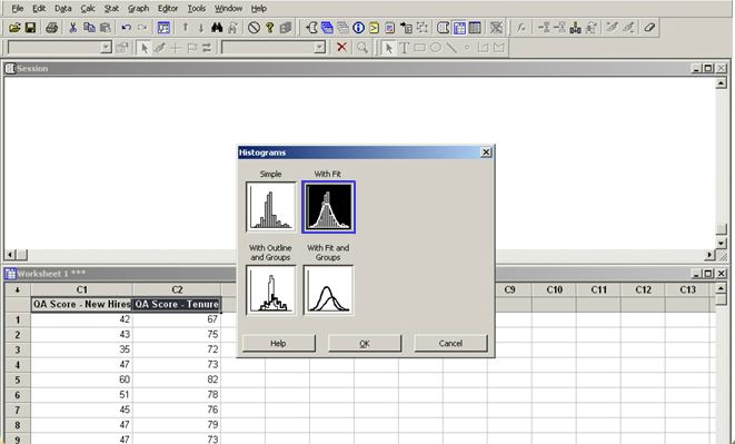
- This brings up the Histogram – With Fit window. Double click C1 and C2, and the variables are displayed in the Graph Variables area.

- Next, click the Multiple Graphs button and the Histograms – Multiple Graphs window is displayed. Select In separate panels of the same graph, and click OK.
- The Histogram – With Fit window is once again displayed. Click OK once again.

- The graph displayed throws up the differences between the two sets of data, enabling easy comparison.

Tools for Second Stage
- Tools used in the second stage of the Analysis phase
- Brainstorming
- Cause and Effect Diagram
- Control Impact Matrix
- 5 Why Analysis
Tools for Second Stage – Brainstorming
- A lateral thinking process to generate unconstrained ideas.
- Elicits involvement of team members affected by the problem.
- Facilitates creative thinking.
- A two – pronged approach: (a) To identify the root cause, (b) To get different solutions for the problem.
- A short-term activity that needs to be scheduled.
- Produces ideas and solutions with stipulated time frame.
- Separates idea generation from organizing of the ideas generated.
- Define the exact issue, topic or business area under focus.
- Allow every individual to complete his/her train of thought.
- Build upon ideas generated or create new ones based on them.
- Ideas generated should be crisp, and clear.
- Evaluate, validate, and categorize ideas only after the session is completed.
- Encourage as many ideas as possible as every idea is a good idea.
- Do not use idea assassins.
- Do not make any visual or verbal judgements when ideas are offered.
- Do not paraphrase any idea when an individual suggests an idea.
- Do not let any individual dominate the session.
Tools for Second Stage – Cause and Effect Diagram (CED)
- After ideas are collected, organize and categorize them using cause and effect diagram (also called Ishikawa diagram or fishbone diagram)

- The concept of CED is that the name of a basic effect is entered at the head of the fish.
- The main possible causes of the problem or the effect are drawn on the bones of the fish.
- The “Six-M” categories typically used as a starting point are manpower, machine, method, material, measurement, and mother nature. You can use different names to suit the problem at hand, or revise these general categories.

- There are three to six main categories that encompass all possible influences.
- Brainstorming is typically done to add possible causes to the main “bones”, and more specific causes to the “bones” on the main “bones”.
- The sub-division continues as long as the problem areas can be further subdivided.
- The depth of this tree is usually about four or five levels.
- When the fishbone is done, a complete picture of all the possibilities about the root causes for the designated problem can be viewed. Then, causes to be acted upon are circled, and thus the use of tool is complete.
Example:
Let us now study an example of CED for the problem of “Poor Soft Skills” in the organization. “Poor Soft Skills” is the key problem, shown in the head of the fish in the figure below. The four different categories of the ideas generated during the brainstorming session are language skills, courtesy or empathy, clarity, and listening skills. Each of these causes is places, accordingly, on the different bones of the fish. These causes are then further divided into sub-causes. For example, language skills are sub-divided into choice of words, phrasing of sentences, and speaking at customers’ level. Similarly, the causes of problems in clarity are bad accent, pronunciation or the speed at which the employee speaks. Thus, after examining all the causes, a decision is taken pertaining to root cause of the poor soft skills problem.

- Helps determine the root causes of a problem using a structured approach.
- Encourages group participation, and utilizes group knowledge of the process.
- Uses an orderly, easy-to-read graphic format to display the cause-and-effect relationships.
- Helps locate the little ‘y’ from under the big ‘Y’
- Indicates the possible causes for variation in a process.
- Increases knowledge of the process by helping everyone to learn more about the factors at work, and how they relate to each other.
- Identifies area where data should be collected for further study.
Tools for Second Stage – Control Impact Matrix
- To validate causes – use “Control Impact Matrix”
- Used to prioritize causes in conjunction with CED after they have been captured/listed.
- Causes/factors are prioritized by looking into each factor to see whether they are within your control, and impact of that factor on problem.

- The first quadrant in the above figure consists of the factors that have a very high impact on the problem. However, the good news is that they can be controlled. Naturally, it follows that this area comes under close scrutiny. If these factors are controlled, the problem automatically diminishes or disappears.
- The second quadrant contains factors that can be controlled, but their impact on the problem is not very strong. These factors may be given a lower priority.
- The third quadrant holds factors that affect the problem in a major way but they are not within control.
- The fourth quadrant consists of factors that are outside your control, but their impact on the problem is low. These factors can just be listed but no action can be taken.
Tools for Second Stage – Five Why Analysis
- Once factors are prioritized
- Pick out causes that are within your control and have a high impact on the problem.
- Use “5 Why Analysis”
- This tool – used to identify potential root cause by drilling down deep into the process.
- By repeatedly asking “Why” you can peel away layers of symptoms that can lead to root cause.
- Often the apparent reason for a problem will lead you to another question.
- For every reason of the question, you need to have a process data for validation.
- You may need to ask the question fewer or more times than five.
Benefits of 5 Why Analysis:
- Helps identify the root cause of a problem.
- Determine relationship between different root causes of a problem.
- A simple tool that does not require any statistical analysis.
Uses of 5 Why Analysis:
- Most useful when faced with problems that involve human factors or intersections.
- Also used in day-to-day business life.
Example:
Here the factor taken up is that of “Language Skills”. You can see in the below figure that the root cause has been found to be ‘Inadequate Training duration for Appropriate Modules’ after asking ‘Why’ 3 times. 
Summary
- Width or spread of the data is displayed by Histogram.
- The median for the data – 15, 22, 28, 16, 21, 17, 22, 15, 19, 26, 27, 22 is 21.5
- “Vital Few Trivial Many” and “80-20 Rule” are the principles of Pareto.
- Bar chart arranged in descending order of height from left to right is called Pareto.
- The method of grouping data by common points or characteristics is called Stratification.
- A structured method of generating unconstrained ideas/solutions is called Brainstorming.
- Strive for quantity during brainstorming.
- CED is the tool used to structure a brainstorming session.
- CED is the tool used after brainstorming to find the potential root cause for a specific problem.
- An Ishikawa diagram is also known as Cause and effect diagram, and Fishbone diagram.
- Prioritization on C/I is done based on Control and Impact.
- The purpose of 5-why analysis is to identify potential causes.
MODULE 6: IMPROVE
Learning Objectives
- Improve phase – divided into three steps
- First step – prioritization of vital causes
- Second step – development of proposed solution
- Third (and final) step – implementation of proposed solution
- Various statistical tools are used
- To prioritize vital causes.
- To develop proposed solution.
Upon completing this module, you will be able to…
- Prioritize the vital causes identified in the Analysis phase.
- Propose solutions for the identified vital causes.
Identify Vital Causes – Scatter Diagram
- To prioritize, validate, and identify vital causes, three statistical tools are needed:
- Scatter diagram
- Correlation
- Regression analysis
- Visual tool for analyzing relationships between two variables.
- Mostly used to prove or disprove cause-and-effect relationships.
- Shows relationships.
- Does not prove that one variable necessarily causes the other.
Example 1:
- Growing taller may lead to more weight.
- Gaining weight does not indicate growing in height.
Example 2:
- Strong relation exists between number of cavities in primary school children and vocabulary size.
- Both are related to age – but one does not cause the other.
The scatter diagram once plotted may seem to have different forms. It is necessary to establish whether a relationship exists between the two variables or not. Let us see how to interpret scatter diagrams with different forms.

- When you draw a straight line from the data point to the last point and all other data points lie very close to the straight line in such a way that both the variables tend to have an increasing effect, you can say that the two variables have a strong positive relationship.
- In the above figure, there is a strong negative relationship, as the straight line has a different effect compared to the first one. Here, one variable tends to decrease as the other increases.
- Similarly, if the data points lie slightly away from the straight line, it indicates a ‘not very strong’ positive or negative relationship.
- If the data points are scattered all around, then it clearly indicates that there is no relationship between the two variables.
- Sometimes the diagram takes a different pattern, making it necessary to further drill down on the data.
Used when:
- You believe that there is a relationship between two variables.
- Data is continuous.
- You require a fast and easy way to test relationships between two sets of numbers.
Example:
Let us see how to draw a scatter diagram using Minitab. The data selected relates CSAT scores in relation to communication skills.

- Click Graph on the Menu bar, and then Scatterplots.
- From the Scatterplots window that appears, select the Simple type of scatter diagram, and click OK.

- The Scatterplot – Simple window is displayed.

- Double click C1, and CSAT appears in the Y variables column.
- Double click C2, and Communication appears in the X variables column.
- Click OK.
- Note: Here we must be careful while selecting the Y variables, as it gives totally wrong interpretation if the data sets are reversed.

- The Scatterplot of CSAT Vs. Communication is displayed.
- There is a positive correlation between the data points.

Identify Vital Causes – Correlation Coefficient
- Statistical technique used to show degree/extent of relationship between two variables.
- Calculates coefficient between each pair of variables.
- Called “Pearson’s Correlation Coefficient”.
- Purpose of correlations – to make prediction about one variable based on what we know about another variable.
- Correlation coefficient quantifies degree of linear association between two variables.
- Correlation coefficient.
- Typically denoted by “r”.
- Has a value that ranges between -1 and +1.
- The closer “r” is to +1 or -1, stronger the relationship between the two variables.
Example 1:
As temperature rises, ice-cream consumption goes up in exact proportion. The hotter it gets, the more ice-cream is consumed. This is a perfect positive correlation. If you calculated correlation coefficient or ‘r’ for this data, you will get a value +1. A coefficient of -1 means perfect negative correlation, which means that when one variable increases, the other decreases.
Example 2: 
It is obvious from the graph that the longer you spend in your doctor’s waiting area, the less happy you become. In fact, happiness declines in exact proportion, as number of hours spent waiting increases. This is a perfect negative correlation. If you calculate ‘r’ for this pair of variables, you will get a value of -1. A coefficient close to zero means the variables are not related.
Example 3:
In this graph there appears to be no correlation between the two variables. A change in big toe measurement appears to have no predictable effect on the IQ of a person. There is no correlation. If you calculate ‘r’ for this pair of variables, you will get a value of 0 (zero).
- Like all statistical techniques, correlation is only appropriate for certain kinds of data.
- Works for data in which numbers are meaningful, usually quantities of some sort.
- Cannot be used for purely categorical data, such as gender, brands purchased or favorite colors.
Example:
Let us see an example where we can find correlation between customer satisfaction scores and various attributes of a call monitoring from Minitab.
- Open Minitab.

- Click Stat on the Menu bar.
- Then click Basic Statistics and Correlation.

- The correlation window is displayed.

- Double click on the required variables for which you need to study the relationships. The variables are displayed in the Variables box.
- The Display p-values option is selected by default.
- Now click OK.

- The correlation of CSAT with the selected variables is displayed.

- Notice that two values are displayed for each pair.
- The value on top indicates the correlation coefficient.
- In this case, the correlation coefficient between time on phone and CSAT is -0.516, and that between communication and CSAT is 0.966
- We can thus conclude that there is a strong positive correlation between communication and CSAT, and there exists a moderate negative correlation between time on phone and CSAT.
Identify Vital Causes – Regression Analysis
- Attempts to discern relationship between a dependent variable and one or more independent variables.
- Used to build relationship Y = f(x) between two or more variables.
- May also be used to analyze relationship between two “X’s” or between “Y” and “X”.
- Objective is to explain variation in the values of the dependent variable.

- Regression is a hypothesis test
- “X” is a significant predictor of response “Y”.
- It may be used to analyze relationships between “X’s” or between ‘Y’ and ‘X’.
- It is powerful but cannot replace process knowledge about trends.
- Regression equation expresses relationship between two (or more) variables algebraically.
- Simple linear regression equation is expressed as

- Y = bo + b1X1
Where Y = response, bo = predicted value of Y when X1 = O, b1 = slope of line, change in Y per unit change in X1.
- In the graph shown, the null hypothesis is that there is no correlation between the two continuous variables.
Example:
Let us take the data on customer satisfaction scores and communication skills of call center agents and calculate the regression equation using the Minitab software to find out the relationship between them.
- Open Minitab.

- Click Stat on the Menu bar.
- Click Regression, and then Regression again.

- The Regression window is displayed.

- You can select the response and predictors.
- Click OK.
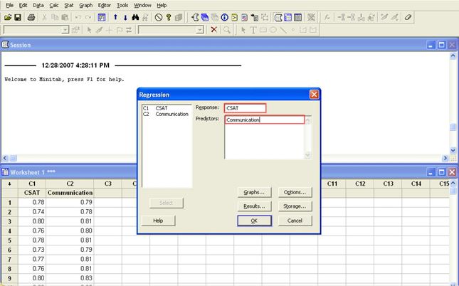
- The Minitab output contains the regression equation, R-Sq (adj) and P Value.
- It shows the relationship between CSAT and communication skills.

- We can predict CSAT from the equation if the communication skills score is known.
- The R-Sq value quantifies the extent to which the regression equation can predict the CSAT.
- Here as the R-Sq (adj) is 92.9% which is above the acceptable percentage of 80%, the regression can be used for prediction.
- The P Value indicates the statistical significance of the relationship.
- As P Value here is less than 0.05, there is a statistical relationship between the two variables.
Propose Solutions – Pugh Matrix
- Proposed solution should lead to
- Performance improvements.
- Benefits to bottom-line.
- Created by Dr. Stuart Pugh, a professor from University of Strathclyde (Scotland).
- Used for evaluating multiple concepts against each other, in relation to a baseline concept known as ‘datum’.
- Datum can be an existing concept or one among concepts being evaluated, which the team feels is most likely to succeed.
- Criteria are laid down, which are ranked or weighted by importance.
- Each concept is assigned scores relative to criteria, and compared to baseline concept.
- Scores are given as each option is compared with base concept, using signs.
- ‘+’ – concept is better than the base concept.
- ‘-‘ – concept is worse than the base concept.
- ‘S’ – no change with respect to base concept.
- Selection is made based on consolidated scores.
- Steps to create a Pugh matrix:
- Choose criteria – The criteria is based on the technical requirements.
- Form the matrix.
- Clarify the concept – The team members must understand all the concepts. New concepts may require a sketch for visualization.
- Choose the datum concept – Select a design that is among the best concepts available for the baseline or datum.
- Create the matrix – Compare every concept to the datum. Use a simple scale to rate the concept. An ‘+’ for a better concept, an ‘-‘ for a worse one and an ‘S’ for a similar one.
- Evaluate the ratings – Add up the scores for each category and analyze their contribution to your insight of the design.
- Decrease the negatives and enhance the positives.
- Actively discuss the most promising concepts – Eliminate or modify the negative ones.
- Select a new datum and re-run the matrix – If no concept is a clear winner, a new hybrid can be entered into the matrix for consideration.
- Arrive at the best solution.
- If further work on matrix is required at the end of first working session:
- Allow team to gather more information, perform experiments, seek technical knowledge, etc.
- Repeat entire process to arrive at a new winning concept.
- Return team to work on the concepts.
- Re-run matrix for further analysis whenever needed.
- Effective for comparing alternatives concepts.
- Scores concepts relative to one another.
- An iterative evaluation method.
- Most effective is each member performs it independently and then compares results.
- Helps compare scores generated and gives insight into best alternatives.
- Determines proposal that best matches customer requirements.
- Typical situations for use:
- When only one improvement opportunity or problem must be selected to work on.
- When only one solution or problem-solving approach can be implemented.
- When only one new product can be developed.
Example:
In this example, Ritz Carlton has been considered as the datum and the alternate hotels such as The Shangri-La, Jetsons, and Homor Simpson have been evaluated with respect to each criteria. If the alternate hotel has same features for a specific criteria, then we rank them as “S”, if it is superior we give a “+”, and a “-” if worse than the datum. Then the weighted sum of positives and negatives are calculated for each of the alternate hotels. 
For example, for Shangri-La, the weighted sum of positives is calculated by adding importance ranking of “Tariff” and “Spa Facilities”, which comes to 4+4=8. We can choose Shangri-La as the best alternate hotel since its weighted sum of positives is the highest compared to the other hotels.
Summary
- The purpose of scatter diagram is to find the relationship between I/P and O/P variable.
- Scatter diagram is used to determine what happens to one variable when another variables change value.
- In the Improve phase of the DMAIC process, we need to know what needs to be done.
- Assume that a positive correlation exists between X and Y. If X is increasing then Y also increases.
- Correlation coefficient ‘r’ ranges between +1 to -1.
- Regression cannot replace process knowledge about trends.
- Pugh matrix is used to generate the concept and select the best out of them.
- Assume that a negative correlation exists between X and Y. If X is increasing then Y also decreases.
MODULE 7: CONTROL
Introduction
- Brings closure to Six Sigma project.
- Critical steps needed to ensure that gains will be sustained:
- Create a control plan to monitor process.
- Documentation of and training for new process.
- Transfer of ownership to process owner/champion.
Learning Objective
- Ensures that process stays in control.
- Sets up measures to detect out of control situations.
Upon completing this module, you will be able to…
- Outline the concept of the control plan.
- Recognize the uses of control charts.
- Understand the use of each type of chart.
Control Plan
- Has a summary of all control activities for the process.
- Lists control activities yet to be implemented.
- Identifies process gaps in current process.
- Includes a training plan to ensure smooth transitions as well as a process auditing system.
- Identifies person responsible for control of each critical variable.
- Intent of a control plan:
- Run process on target.
- Meet customer requirements.
- Minimize variations about target.
- Purpose of a control plan:
- Institutionalize process improvements.
- Highlight areas requiring extra education.
- Provide one-stop step for control information.
Example:
In this example, the process step to be controlled is training delivery, and the critical input identified for this process step is training schedule. The output of this process step is percentage adherence to training schedule. The Sigma level for this process step has been calculated to be 3.5 Sigma. Training of the training adherence is done using the training tracker.  For this process step, repeatability and reproducibility are not applicable as there is no measurement gauge for measuring this metric. As adherence needs to be tracked on a real time basis for all batches, the sample size in this case is 100%, and the sample frequency is every batch conducted. Next we need to identify a method to monitor the schedule adherence during training, so that any deviation from the plan is highlighted. The control method identified in this case is the publishing of the training MIS by the process owner, who is also the training coordinator. The training coordinator would be reviewing the MIS for any deviations against the specifications. All such deviations would be escalated to the training head, so that necessary actions are taken to keep the process under control.
Control Charts
- Control plan – Plan for action to be taken.
- Control charts:
- Graphical representation of process data.
- Determine whether process is under control or out of control.
- Used by process owners for online monitoring and control of process.
- Help process owners to steer process, giving alerts as and when required.
- Difference between control charts and other graphical tools:
- Data in control chart is plotted on a time ordered basis.

- A typical control chart has three basic components:
- A centerline, the mathematical average of all samples plotted.
- Upper and lower statistical control limits that define the constraints of common cause variants.
- Performance data plotted over time.
- Collected from process on equally spaced time intervals.
- Plotted in the same time order.
- Scattered between control limits.
- When the data points cross control limits or if any abnormal patterns are seen, it indicates:
- Process is out of control.
- Action needs to be taken.
- Easy to use and understand.
- Can be directly used by frontline agents.
- Act as traffic signal and help in performing process consistently and in a more predictable manner.
- Help in identifying and distinguishing between common causes and special causes of variations
- Help achieve higher quality of work with low costs and higher effective capacity.
- Charts are broadly classified according to quality characteristic they monitor:
Control Charts – Appropriate Selection
Flow diagram which serves as a basic guide in selecting the apppropriate control chart for the different situations:

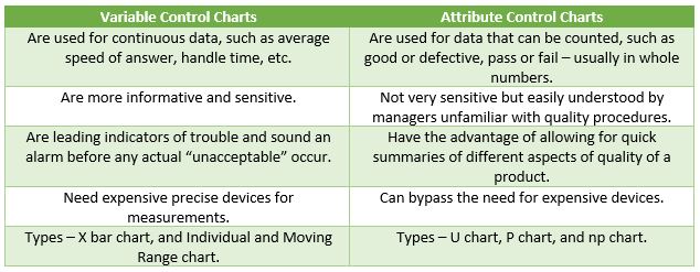
Let us look at the variable chart first:

- Type of control charts to be used for variable data depends on possibility of sub-grouping.
- Collecting data at specified interval of time on a daily basis at same interval -> sub-grouping.
- X bar R chart
- If data collected can be sub-grouped, use X bar R chart.
- Individual and Moving range:
- If sub-grouping is not possible, individual and moving range are used.
- Each data point will have to be plotted to get graphical output.
Now, let us look at the attribute chart:

- Failure of one or more attributes of a unit to confirm to requirements.
- For example, dents, scratches, bubbles, cracks.
- Failure of entire unit to confirm to requirements.
- For example, a light bulb either works or it does not.
- For selecting appropriate attribute chart, check type of data samples collected – defect type or defective type.
- If sample size of data is variable:
- For defect type, use U-chart.
- For defective type, use P-chart.
- If sample size of data is constant:
- For defect type, use C-chart.
- For defective type, use np-chart.
Example 1:
- Average Speed of Answering (ASA) is continuous data.
- Select variable type of control chart.
- As rational sub-grouping is not possible, X bar chart cannot be used.
- Use ‘individuals and moving range chart’ for all variable data.
Example 2:
- Attribute data – so use attribute type control chart.
- Sample size is not constant.
- Fatal call is ‘defective data’, hence use P-chart.
Control Chart – Types
- Variation occurs in all processes
- Common cause variations – natural part of process.
- Special cause variations: (a) From outside the system, (b) Cause recognizable patterns, shifts, or trends in data.
- A process is in control when only common causes affect process output.
Individual and Moving Range Charts
- Plot of individual values over time.
- Plot of the moving range.
- Range is difference between second data point and previous data point.
- Opportunities to obtain data are limited.
- Sub-grouping is not possible.
Example:
- Where sampling forms are homogeneous batches.
- When samples have very short term variations.
To get a clearer understanding let us analyze the QA scores taken on different days and find out whether the process is in control or not by drawing an IMR chart using Minitab.

- Go on the Menu bar and click Stat.
- Select Control Charts – Variables Charts for Individuals – I-MR from the drop down lists.

- The individuals – Moving Range Chart window is displayed.

- Double click C1, and QA Scores is displayed in the Variables field.

- Click OK.
- The I-MR Chart of QA Scores is displayed.

- As all the above observations are randomly distributed without any pattern and falls within the control limits, we can conclude that the process is in control.
- Individuals chart
- Plots values of each individual observation in order of observation.
- Provides a means to asses the process center.
- Plots the range calculated from successive observations.
- Provides a means to assess process variation.
- An in-control process exhibits only random variation within the control limits.
- An out-of-control process exhibits unusual variation, due to the presence of special causes.
Attribute Control Charts
- Attribute data can be classified and counted.
- Two types of attribute data:
- Defect type of data: (a) U-chart, (b) C-char
- Defective type of data: (a) P-chart, (b) np chart
- Used when data collected in sub-groups of variable sample size.
- Used when data pertains to defect type of data.
- Show how process changes over time and determines whether it is in control.
- Show how the process is measured to assess number of defects per unit of measurement.
Example:
To analyze the number of defects made on the monitored calls, let us draw a U-chart using Minitab, and verify whether the process is in control or not.

- Go to Menu bar and click Stat.
- Select Control Charts – Attributes Charts – U from the drop down list.

- The U Chart window is displayed.

- Click C2, and No. of Defects is displayed in the Variables field.
- Click C1, and No. of Calls Monitored is displayed in the Subgroup sizes field.
- Click OK.

- The U Chart of No. of Defects is displayed.

- The graph shows a process which is in control.
- An in-control process exhibits only random variation in the number of defects per unit of measurement while an out-of-control process exhibits unusual variation in the number of defects per unit due to the presence of special causes.
-
P-Chart
- Attributes control chart used when data collected in sub-groups is not constant.
- ‘P’ comes from use of proportion of nonconforming items.
- Shows a proportion of defective items rather than actual count.
- Proportion deals with percentage of success, so P-chart describes a success or failure.
- A study of proportion of defectives determines whether or not the process is in control.
Example:
To analyze the number of defective calls, let us draw a P-chart using Minitab, and verify whether the process is in control or not.
- Open Minitab.
- Go to the Menu bar and click Stat.
- Select Control Charts – Attributes Charts – P from the drop down lists.
- The P Chart window will be displayed.

- Click C2, and Call Failed due to Fatal is displayed in the Variables field.
- Click C1, and No. of Calls Monitored is displayed in the Subgroup sizes field.
- Click OK.

- The P Chart of Call Failed due to Fatal is displayed.

- The graph shows a process which is in control.
- An in-control process exhibits only random variation in the proportion of defectives per sample while an out-of-control process exhibits non-random variation in the proportion of defectives per sample, which may be due to the presence of special causes.
Note:
C and Np charts are used when the data sample is constant over a period of time. In a service industry the sample size is always variable and sio these charts are not applicable.
Summary
- AHT and ASA can be used for variable charts.
- Data of Fatal Calls can be used for attribute charts.
- If data is variable and sub grouping is possible, Xbar-R chart has to be used.
- U chart and C chart can be used when the data is defect type.
- P chart can be used when Sample size is variable and data is defective type.
- Control charts are used to study process change over time.
- If data is variable and sub grouping is not possible, I-MR chart has to be used.
- LCL stands for Lower Control Limit.
- When a data is falling outside both UCL & LCL, then we can say that the AHT process is having a special cause.
- If data is defective type, nP chart can be used.
- We can use C chart when Sample size is constant and data is defect type.
GLOSSARY
- BB (Black Belt) – A process improvement project team leader who is trained and certified in Six Sigma methodology and tools and who is responsible for successful project execution.
- Brainstorming – A tool used by a group to encourage creative thinking and new ideas. No discussion, evaluation, or criticism of ideas is allowed until the session is complete.
- Business Case – An element of the team charter which defines the financial impact of the project.
- Causality – The principle that every change implies the operation of a cause.
- C chart – An Attributes data control chart that evaluates process stability by charting the counts of occurrences of a given event in successive samples.
- Cause and Effect (CED) – A tool used to analyze a problem (cause) that contributes to a given situation (effect) by breaking down the main causes into smaller sub-causes. It is also known as the Ishikawa or the fishbone diagram.
- Champion – Individuals who leads a Six Sigma initiative.
- Continuous Data – A type of data that makes up the rest of numerical data and is associated with some sort of physical measurement.
- Control Chart – A tool used to monitor variances in a process over time and alert the business to unexpected variance which may cause defects.
- Control Impact Matrix – A tool used to prioritize the causes in conjunction with CED after they have been captured or listed.
- COPC – Customer Operation Performance Center.
- Correlation – A statistical technique used to show the degree or extent of the relationship between two variables.
- CTQ (Critical to Quality) – Element of a process which has a direct impact on its perceived quality.
- Data Collection Plan – A plan that lays down the purpose and method of collecting the data, to find out the variance in what the customer wants and what has been produced.
- Descriptive Statistics – A tool used to analyze and interpret the data centre and its spread, after the data is collected.
- Discrete Data – A type of data that has only a finite number of values.
- Distribution – A distribution is an arrangement of values of a variable showing their observed or theoretical frequency of occurrence.
- DMAIC – Define, Measure, Analyze, Improve, and Control.
- DPMO – Defects Per Million Opportunities.
- DPU – Defects Per Unit.
- Five Why Analysis – A tool used to identify the potential root cause by drilling down deep into the process.
- Goal Statement – An element of the team charter which lays down the project’s goal or target that the team has to achieve.
- Green Belt – An employee trained in Six Sigma who spends a portion of time completing projects, but maintains regular work role and responsibilities.
- Histogram – A basic graphing tool showing the distribution of measurement data. It pictorially reveals the amount and type of variation within a process.
- I-MR – Individual – Moving Range Chart. A control chart for variable data that uses individual measurements of a quality characteristic.
- Left Skewed Distribution – In a left skewed distribution, less data is in the left tail of the curve. The mean is on the left and the median is between the mode and the mean.
- MBB (Master Black Belt) – A person who is an “expert” on Six Sigma techniques and on project implementation. Master Black Belts play a major role in training, coaching and in removing barriers to project execution in addition to overall promotion of the Six Sigma philosophy.
- Mean – The average of a group of measurement values, it is determined by dividing the sum of the values by the number of values in the group.
- Median – The middle of a group of measurement values when arranged in numerical order. If the group contains an even number of values, the median is the average of the two middle values.
- Milestone – An element of the team charter which is a detailed project plan with key steps and target completion dates tied to every phase of the DMAIC process, with well-defined tollgate reviews.
- Minitab – A statistical software package that operates on Microsoft Windows with a spreadsheet format and has powerful statistical analysis ability.
- Mode – The most frequently occurring value in a group of measurements.
- Normal Curve – A statistical tool used to show how far the sample is likely to be off from the overall distribution. The curve is in the form of a bell.
- Normal Distribution – In normal or symmetrical distribution, mean, median and mode are all the same. Data is symmetrically distributed about the centre (Mean) with no skewness.
- nP Chart – A control chart indicating the number of defective units in a given sample. It is used when the data pertains to defective data.
- P Chart – An attributes control chart used when the data collected in sub-groups is not constant and varies from time to time. It is used when the data pertains to defective data.
- Pareto Chart – A bar chart that focuses on efforts or the problems that have the greatest potential for improvement by showing relative frequency or size in a descending bar graph. It is based on the Pareto principle, 20% of the sources cause 80% of any problems.
- Problem Statement – An element of the team charter which describes the problem in a clear and concise manner, and addresses what is specifically wrong or what is not meeting the customer’s expectations.
- Process Capability Analysis – A tool used to measure the baseline performance of a characteristic. It indicates the inherent variation for a given event in a stable process, defined as the process width divided by Six Sigma.
- Process Map – A visual representation which enables participants to visualize an entire process that transforms well-defined inputs into pre-defined outputs.
- Process Owner – Individual who is responsible for a specific process.
- Product Drill-Down Tree – A graphical tool used to show the breaking down of complex problems into progressively smaller parts into different levels of detailed actions.
- Project Scope – An element of the team charter which states the list of processes that the team has to focus on, and the boundaries of the processes that have to be improved, including exclusions.
- Pugh Matrix – A scoring matrix used for evaluating multiple concepts against each other, in relation to a baseline concept known as the ‘datum’.
- Regression – A statistical technique for determining the best mathematical expression that describes the function relationship between one response and one or more independent variables.
- Regression Analysis – A statistical tool that attempts to discern the relationship between a dependent variable and one or more independent variables. It is used to build the relationship Y=f(x) between two or more variables.
- Resource Plan – An element of the team charter which has the details of the roles, responsibilities and the authority of the team members, team lead and the coach.
- Right Skewed Distribution – In a right skewed distribution, the data is less in the right tail of the curve. The mean is on the right and the median is between the mode and the mean.
- Scatter Diagram – A visual tool for analyzing relationship between two variables.
- SD (Standard Deviation) – A measure that displays the relation of a set of scores to the mean of the sample. A large standard deviation indicates that the data points are far from the mean and a small standard deviation indicates that they are clustered closely around the mean.
- SIPOC – Stands for “Suppliers Inputs Processes Outputs Customers”. A high level process map used to identify all relevant elements of a process improvement project before the work begins.
- Sigma Defect – Anything outside customer specifications.
- Sigma Opportunity – Total number of chances for a defect to occur.
- Six Sigma – A term coined by Motorola to express process capability in parts per million. A Six Sigma process generates a maximum defect probability of 33.4 parts per million (PPM) when the amount of process shifts and drifts are controlled over the long term to less than +1.5 standard deviations.
- SMART – Specific, Measurable, Attainable, Relevant and Time bound.
- Statistical Process Control – Analysis and control of a process through the use of statistical techniques, particularly control charts.
- Statistics – The mathematical science of collecting, describing, analyzing, and interpreting a given set of data.
- Stratification – A technique used to analyze or divide a universe of data into homogeneous groups or strata.
- Team Charter – A formal document that states the expectations from the team during each stage of the project and lays down what the expected outcome will be at the end of the project.
- Team Charter Format – An element of the team charter – it is a live document and can be modified during any phase of the DMAIC methodology, but only with the approval of the champion.
- TOP – Total Opportunities.
- U Chart – An attributes control chart used when the data collected in sun-groups is not constant and varies from time to time. It is used when the data pertains to defect data.
- Variance – A change in a process or business practice that may alter its expected outcome.
- X Bar or Run Chart – Also known as a line chart, or line graph. A chart that plots data over time, allowing an identification of trends and anomalies.
- Yellow Belt – Person who has a basic knowledge of Six Sigma, but does not lead any projects. Responsible for the development of process maps to support Six Sigma.